Start with the finished size
A font that looks clear on screen can lose its openings when sewn small. Set the intended letter height before spending time on detail. Look at stroke widths, gaps between letters, and counters—the enclosed spaces inside letters such as O and D.
If you are using Studio’s lettering tool, choose an installed font and adjust cap height, tracking, line spacing, and single-line curvature. Keep the lettering recipe so you can revisit those choices. If you are tracing a logo image, compare the resulting outlines directly with the original rather than substituting a similar font.
Use satin sections that follow the strokes
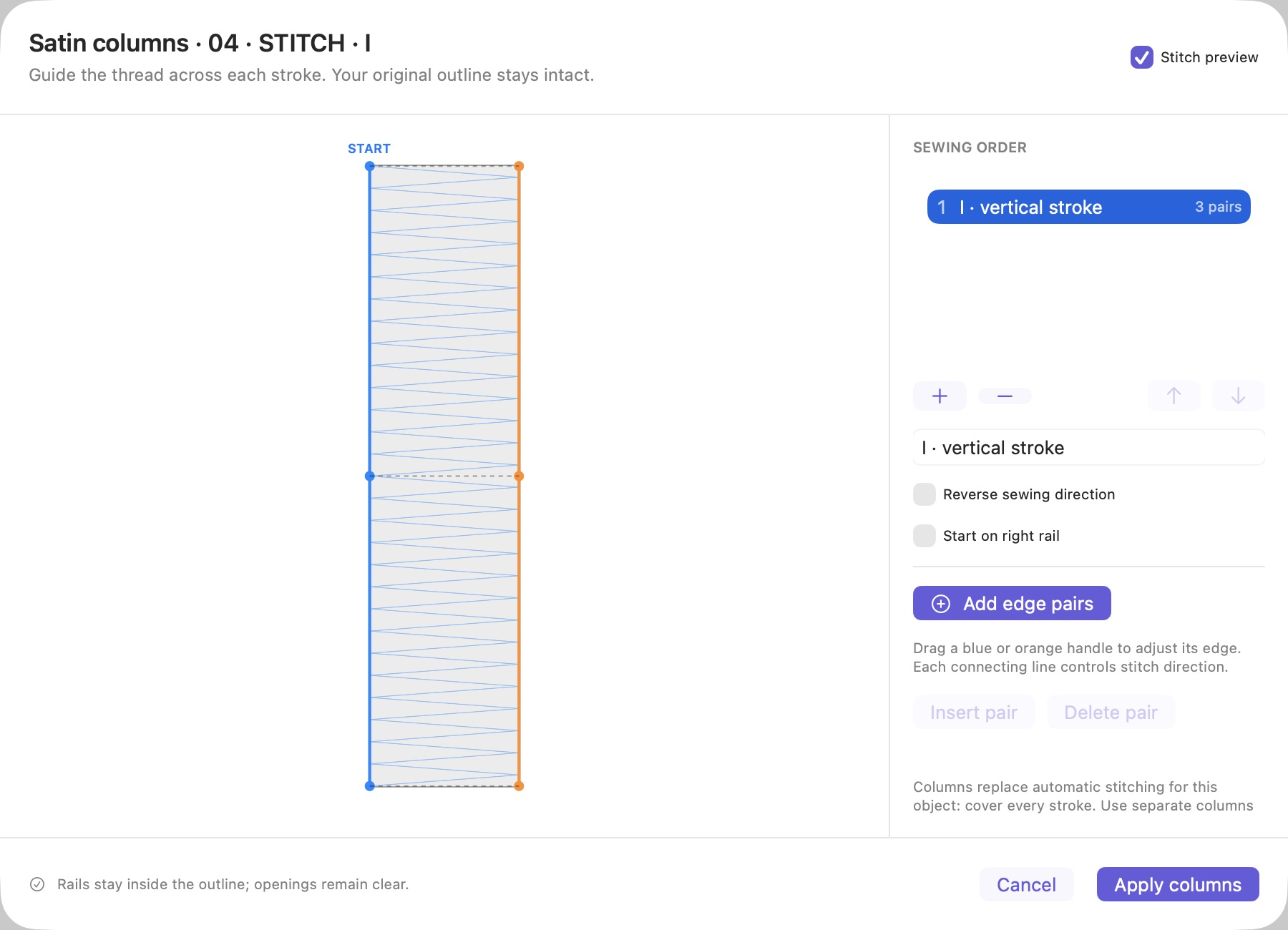
Satin stitches span between the edges of a column. They are often useful for lettering strokes, while larger filled areas may need a different stitch plan. In Studio, paired rail points and multiple satin sections let you shape the column and control section order and direction.
Do not treat a branched letter as one uninterrupted rectangular column. Split the work into sections that follow its strokes, then inspect where those sections meet. Check that rail pairs remain ordered and do not cross, and review any invalid-geometry warnings before continuing.
For background on the technique, the Ink/Stitch satin-column documentation explains satin construction and underlay. Studio’s controls are different; use the paired-rail editor shown above for this workflow.
Three details worth checking: K, G, and V
- K: inspect the branch where the diagonal arms meet the vertical stem. The interior space should remain recognizable, and the stitch plan should not add an unintended bar across it.
- G: preserve the mouth and the horizontal crossbar. Excessive simplification or compensation can make the opening look closed.
- V: compare the bottom with the source. Keep a pointed tip when the artwork has one, but retain a flat foot when that is part of the font. A smooth result should still be the same letter.
Zoom out as well as in. A technically smooth outline can still change the visual weight or proportion of the word. Use the source overlay to check the whole shape, not just individual anchors.
Match heights without stretching the words
Words with different letter counts generally need different widths to share the same letter height. Giving LOVE and OF identical widths makes the shorter word appear much larger. Instead, choose a common height, preserve proportions, and set a maximum width for the collection.
Studio’s Match Sizes workflow supports a shared height within a width limit. If one design exceeds the limit, lower the shared height until the widest design fits. Check the encoded DST bounds at export, since the stitch plan can extend beyond the original outline.
Review density, underlay, and travel together
A fabric preset is a starting point. Review spacing, underlay, compensation, and stitch length at the actual sewing size. A heavier stitched area is not automatically a clearer letter, especially when narrow openings need to stay open.
Simulate the sequence between letters and sections. Check jumps and trim placement, then use the stitch editor when a particular needle movement needs attention. Save the source project before experimenting so you can return to the editable lettering.
Finish with a measured sample
Export after resolving blocking validation errors and reviewing warnings. Sew the sample using the intended fabric, stabilizer, needle, and thread. Compare letter height, gaps, and shape with the target design; record the settings and the revision used.
For an image-based wordmark, start with tracing and converting the artwork to DST. For lettering inside a badge, plan the background and finishing edge using the patch design guide.
MAKE YOUR NEXT DESIGN
Bring the details into Studio.
Explore the actual Mac workspace, see the workflow, and choose the plan that fits your work.
Compare plans ↗